

Matplotlib histogram is used to visualize the frequency distribution of numeric array by splitting it to small equal-sized bins. In this article, we explore practical techniques that are extremely useful in your initial data analysis and plotting.
Content
- What is a histogram?
- How to plot a basic histogram in python?
- Histogram grouped by categories in same plot
- Histogram grouped by categories in separate subplots
- Seaborn Histogram and Density Curve on the same plot
- Histogram and Density Curve in Facets
- Difference between a Histogram and a Bar Chart
- Practice Exercise
- Conclusion
1. What is a Histogram?
A histogram is a plot of the frequency distribution of numeric array by splitting it to small equal-sized bins.
If you want to mathemetically split a given array to bins and frequencies, use the numpy histogram() method and pretty print it like below.
import numpy as np
x = np.random.randint(low=0, high=100, size=100)

# Compute frequency and bins
frequency, bins = np.histogram(x, bins=10, range=[0, 100])

# Pretty Print
for b, f in zip(bins[1:], frequency):
    print(round(b, 1), ' '.join(np.repeat('*', f)))
The output of above code looks like this:
10.0 * * * * * * * * *
20.0 * * * * * * * * * * * * *
30.0 * * * * * * * * *
40.0 * * * * * * * * * * * * * * *
50.0 * * * * * * * * *
60.0 * * * * * * * * *
70.0 * * * * * * * * * * * * * * * *
80.0 * * * * *
90.0 * * * * * * * * *
100.0 * * * * * *
The above representation, however, won’t be practical on large arrays, in which case, you can use matplotlib histogram.
2. How to plot a basic histogram in python?
The pyplot.hist() in matplotlib lets you draw the histogram. It required the array as the required input and you can specify the number of bins needed.
import matplotlib.pyplot as plt
%matplotlib inline
plt.rcParams.update({'figure.figsize':(7,5), 'figure.dpi':100})
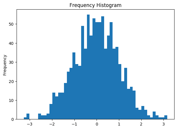
# Plot Histogram on x
x = np.random.normal(size = 1000)
plt.hist(x, bins=50)
plt.gca().set(title='Frequency Histogram', ylabel='Frequency');
3. Histogram grouped by categories in same plot
You can plot multiple histograms in the same plot. This can be useful if you want to compare the distribution of a continuous variable grouped by different categories.
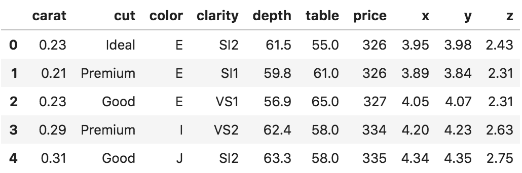
Let’s use the diamonds dataset from R’s ggplot2 package.
import pandas as pd
df = pd.read_csv('https://raw.githubusercontent.com/selva86/datasets/master/diamonds.csv')
df.head()
Let’s compare the distribution of diamond depth for 3 different values of diamond cut in the same plot.
x1 = df.loc[df.cut=='Ideal', 'depth']
x2 = df.loc[df.cut=='Fair', 'depth']
x3 = df.loc[df.cut=='Good', 'depth']

kwargs = dict(alpha=0.5, bins=100)

plt.hist(x1, **kwargs, color='g', label='Ideal')
plt.hist(x2, **kwargs, color='b', label='Fair')
plt.hist(x3, **kwargs, color='r', label='Good')
plt.gca().set(title='Frequency Histogram of Diamond Depths', ylabel='Frequency')
plt.xlim(50,75)
plt.legend();
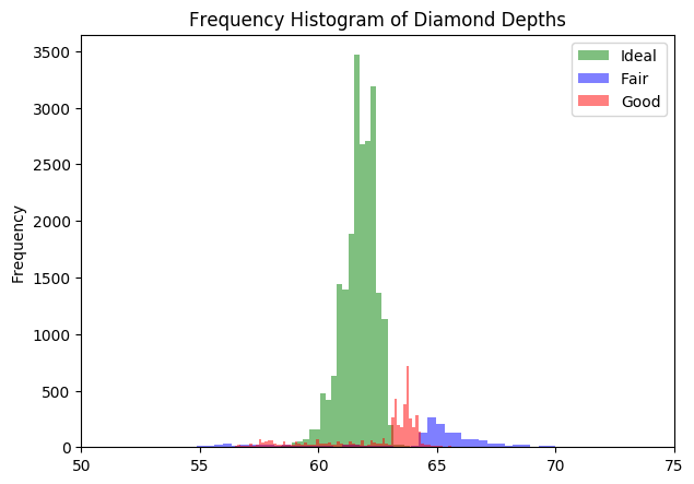
Well, the distributions for the 3 differenct cuts are distinctively different. But since, the number of datapoints are more for Ideal cut, the it is more dominant.
So, how to rectify the dominant class and still maintain the separateness of the distributions?
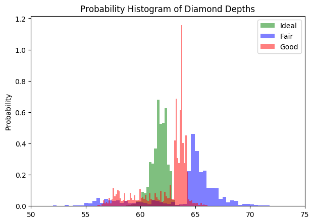
You can normalize it by setting density=True and stacked=True. By doing this the total area under each distribution becomes 1.
# Normalize
kwargs = dict(alpha=0.5, bins=100, density=True, stacked=True)

# Plot
plt.hist(x1, **kwargs, color='g', label='Ideal')
plt.hist(x2, **kwargs, color='b', label='Fair')
plt.hist(x3, **kwargs, color='r', label='Good')
plt.gca().set(title='Probability Histogram of Diamond Depths', ylabel='Probability')
plt.xlim(50,75)
plt.legend();
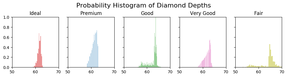
4. Histogram grouped by categories in separate subplots
The histograms can be created as facets using the plt.subplots()
Below I draw one histogram of diamond depth for each category of diamond cut. It’s convenient to do it in a for-loop.
# Import Data
df = pd.read_csv('https://raw.githubusercontent.com/selva86/datasets/master/diamonds.csv')

# Plot
fig, axes = plt.subplots(1, 5, figsize=(10,2.5), dpi=100, sharex=True, sharey=True)
colors = ['tab:red', 'tab:blue', 'tab:green', 'tab:pink', 'tab:olive']

for i, (ax, cut) in enumerate(zip(axes.flatten(), df.cut.unique())):
    x = df.loc[df.cut==cut, 'depth']
    ax.hist(x, alpha=0.5, bins=100, density=True, stacked=True, label=str(cut), color=colors[i])
    ax.set_title(cut)

plt.suptitle('Probability Histogram of Diamond Depths', y=1.05, size=16)
ax.set_xlim(50, 70); ax.set_ylim(0, 1);
plt.tight_layout();
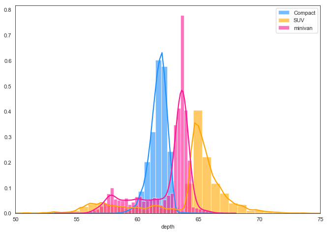
5. Seaborn Histogram and Density Curve on the same plot
If you wish to have both the histogram and densities in the same plot, the seaborn package (imported as sns) allows you to do that via the distplot(). Since seaborn is built on top of matplotlib, you can use the sns and plt one after the other.

import seaborn as sns
sns.set_style("white")

# Import data
df = pd.read_csv('https://raw.githubusercontent.com/selva86/datasets/master/diamonds.csv')
x1 = df.loc[df.cut=='Ideal', 'depth']
x2 = df.loc[df.cut=='Fair', 'depth']
x3 = df.loc[df.cut=='Good', 'depth']

# Plot
kwargs = dict(hist_kws={'alpha':.6}, kde_kws={'linewidth':2})

plt.figure(figsize=(10,7), dpi= 80)
sns.distplot(x1, color="dodgerblue", label="Compact", **kwargs)
sns.distplot(x2, color="orange", label="SUV", **kwargs)
sns.distplot(x3, color="deeppink", label="minivan", **kwargs)
plt.xlim(50,75)
plt.legend();
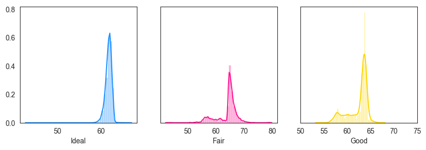
6. Histogram and Density Curve in Facets
The below example shows how to draw the histogram and densities (distplot) in facets.
# Import data
df = pd.read_csv('https://raw.githubusercontent.com/selva86/datasets/master/diamonds.csv')
x1 = df.loc[df.cut=='Ideal', ['depth']]
x2 = df.loc[df.cut=='Fair', ['depth']]
x3 = df.loc[df.cut=='Good', ['depth']]

# plot
fig, axes = plt.subplots(1, 3, figsize=(10, 3), sharey=True, dpi=100)
sns.distplot(x1 , color="dodgerblue", ax=axes[0], axlabel='Ideal')
sns.distplot(x2 , color="deeppink", ax=axes[1], axlabel='Fair')
sns.distplot(x3 , color="gold", ax=axes[2], axlabel='Good')
plt.xlim(50,75);
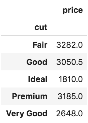
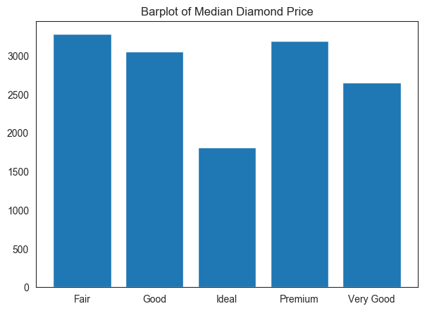
7. Difference between a Histogram and a Bar Chart
A histogram is drawn on large arrays. It computes the frequency distribution on an array and makes a histogram out of it.
On the other hand, a bar chart is used when you have both X and Y given and there are limited number of data points that can be shown as bars.
# Groupby: cutwise median
price = df[['cut', 'price']].groupby('cut').median().round(2)
price
fig, axes = plt.subplots(figsize=(7,5), dpi=100)
plt.bar(price.index, height=price.price)
plt.title('Barplot of Median Diamond Price');
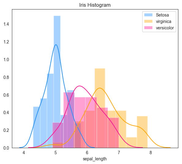
8. Practice Exercise
Create the following density on the sepal_length of iris dataset on your Jupyter Notebook.
import seaborn as sns
df = sns.load_dataset('iris')
# Solution
import seaborn as sns
df = sns.load_dataset('iris')

plt.subplots(figsize=(7,6), dpi=100)
sns.distplot( df.loc[df.species=='setosa', "sepal_length"] , color="dodgerblue", label="Setosa")
sns.distplot( df.loc[df.species=='virginica', "sepal_length"] , color="orange", label="virginica")
sns.distplot( df.loc[df.species=='versicolor', "sepal_length"] , color="deeppink", label="versicolor")

plt.title('Iris Histogram')
plt.legend();
9. What next
Congratulations if you were able to reproduce the plot.
You might be interested in the matplotlib tutorial, top 50 matplotlib plots, and other plotting tutorials.